A logo represents the face of a company. With its logo, the company can set a certain level of renewed expectations from its customers, and it is in the best interest of that company to meet those expectations. The best way to signal change and freshness in a company is via its logo.
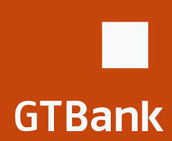
If you look at GTB’s logo, you will see that the background color is of orange with GTBank written on it in white. What does this logo mean? Check below for the answer:
GTBank makes use of orange as its brand color. This is what they call Orange Rule in the company. According to the bank, Orange Rule means principles for life, relationships, success and progression. The bank insists these are the guiding principles of their bank to their banking activities and every other thing they do.
GTBank keeps the logo as simple as this because they believe such simplicity will promote progress, easy understanding between bank and clients, and clarity. The simplicity of the logo translates to their straightforwardness. It also shows that bank is direct with their customers and also very easy to deal with. They prefer to make every seemingly complex situation uncomplicated.
The bank believes that complexity will culminate into a feeling of helplessness, discouragement and confusion. They believe simplicity is also a sign of professionalism, which is a message the bank desires to pass across to its clients, through its logo, about its financial activities.
The orange color looks friendly. GTBank desires to inform its clients that they are ready to work together with the client for their mutual benefits.